Scottish Cycling Rebrand
Every branding project brings a sense of responsibility to align our thinking with the organisation’s audiences’ hopes and ambitions and we take that responsibility seriously. The best place to start is always with audience insight, to understand their challenges and to identify compelling messages that they will respond to positively. To truly represent the spirit of the organisation - not only what it does, but also what it stands for.
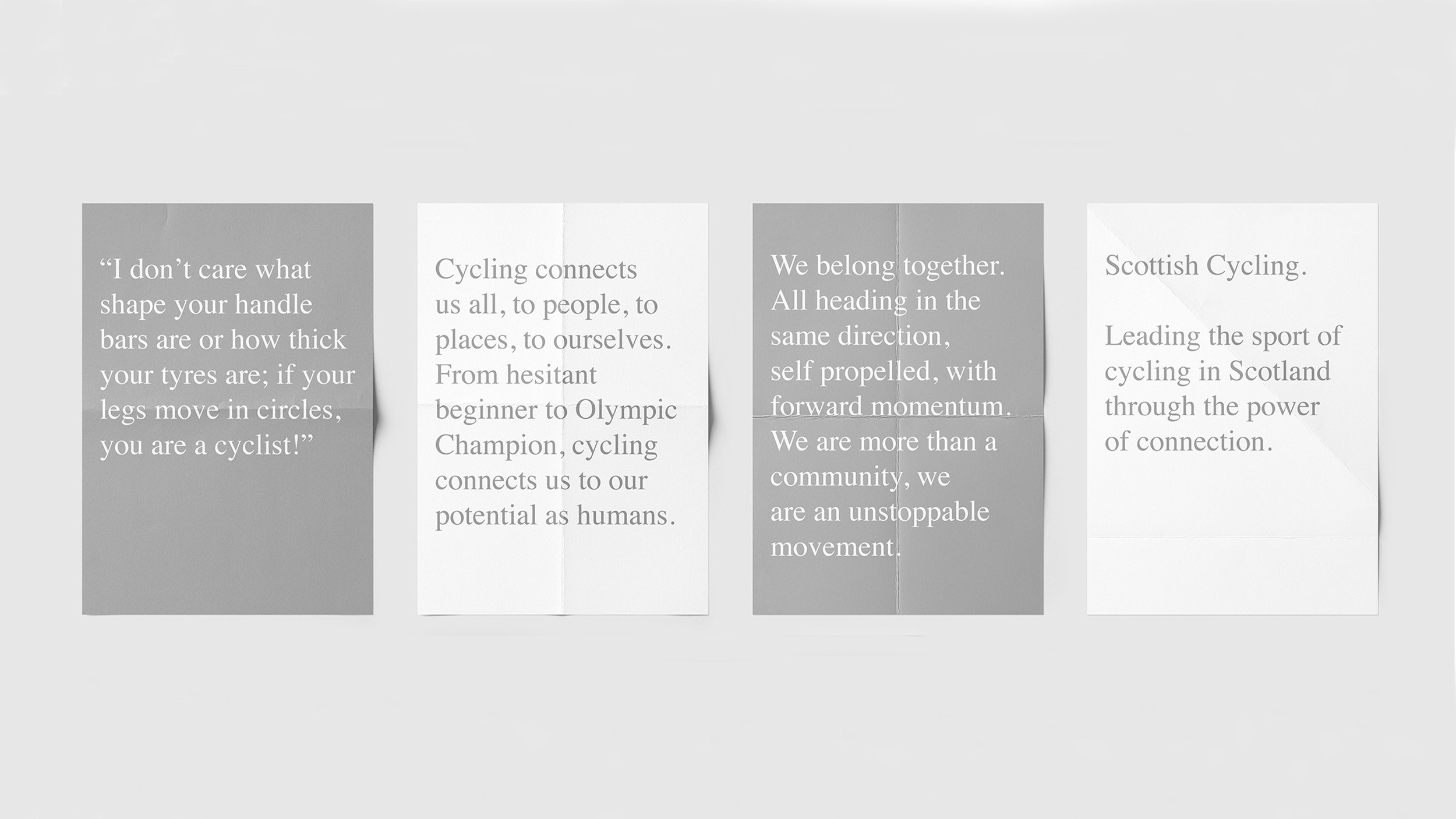
In this case we looked at what the role of a modern governing body is; despite the wide variety of disciplines and the equally wide variety of abilities and motivations for cycling, they connect people to their potential and to pathways to improve.
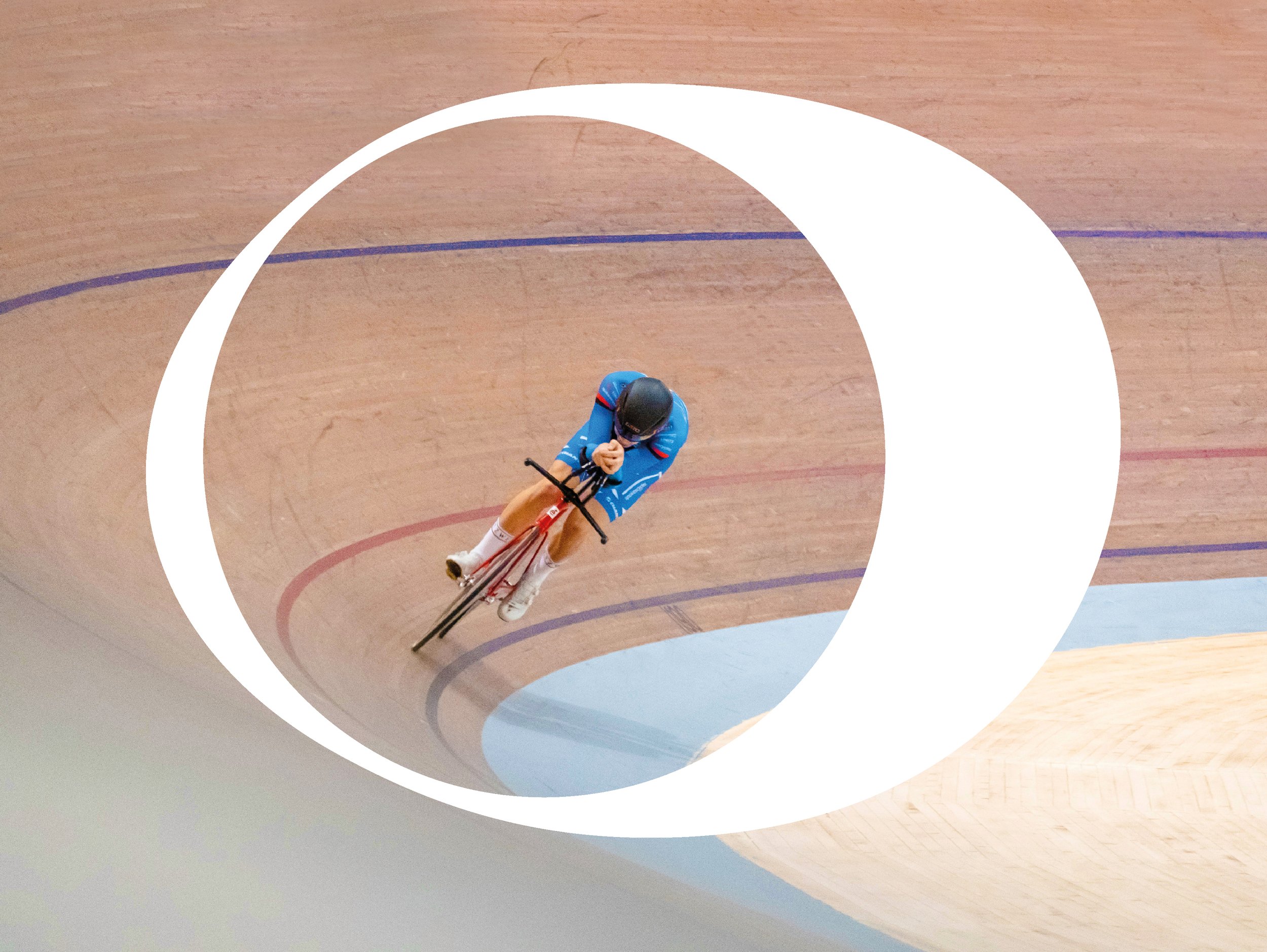
We were able to link the actual activity of cycling; the connection of the human body to the bike through the pedal stroke that every cyclist makes, from nervous beginner to Olympic champion, and the commonality of that action that connects the whole Scottish Cycling community, perfectly articulated through the ‘power of connection’ icon at the heart of the identity.
We are delighted to announce that our work was recognised by our peers winning the Design Effectiveness category at this years’ Scottish Design Awards.
Deliverables:
- Audience insight
- Strategic positioning
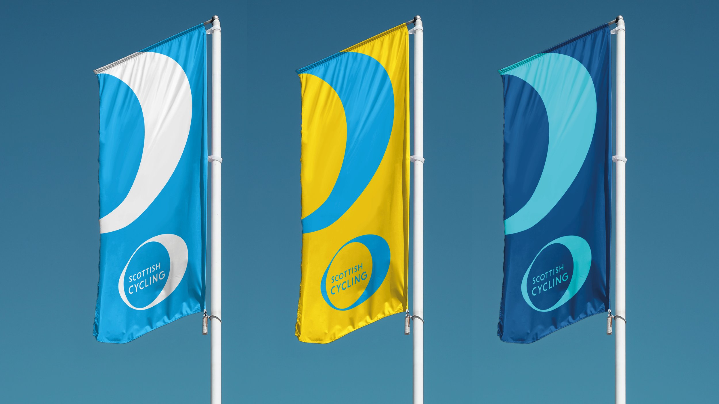
- Visual identity
- Brand guidelines
- Brand toolkit of assets


“Working with Brand Oath and a number of colleagues from across the organisation, I speak on behalf of everyone involved in saying I’m extremely proud of what we’ve managed to achieve.
“Our new look is modern, bold and a breath of fresh air, breaking the mould on what a governing body’s logo should look like, but with a rationale that is extremely strong and something everyone in our diverse community can relate to. I look forward to rolling it out over the coming weeks and months.”
Pete Matthews, Scottish Cycling, Head of Marketing & Communications